Echo Companion app motion study

Exploring cohesive interaction patterns across Amazon’s Kindle Fire and Echo Companion App.

Client

Amazon

Responsibilities

UX, UI, Motion Design, Interaction, Prototyping

Deliverables

Flows
InteractionsMotion Study
App Design

The Amazon family of devices was growing rapidly. We needed to explore opportunities to create a sense of familiar patterns and repeatable processes that would create continuity for our customers.

Project Summary

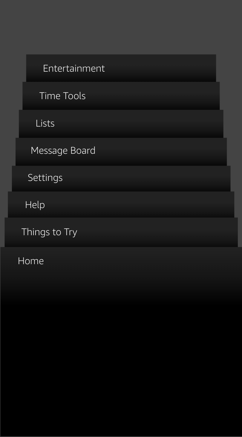
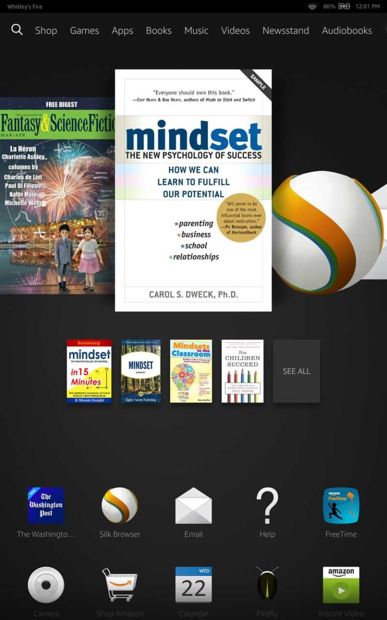
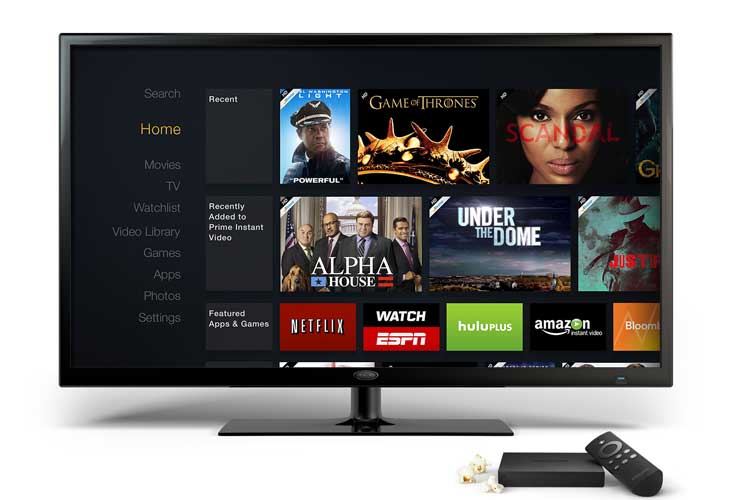
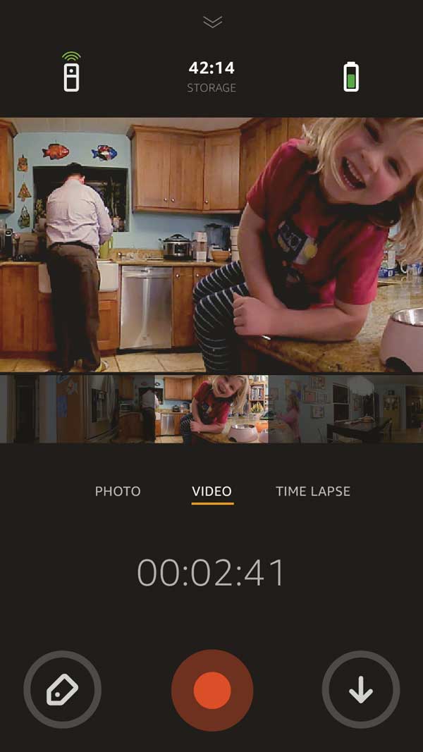
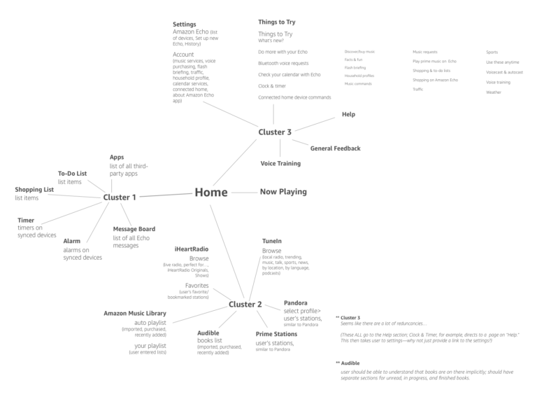
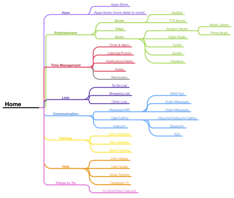
The Amazon line of products exploded in 2014 and 2015. At the same time Echo was making its way into consumers’ homes, we were also working on Dot, Show, Look, and several new styles of Kindle Fire. As a designer, I couldn’t help but notice disparities among product experiences.

This motion study sought to address some of those disparities by showing a more cohesive system of interfaces and interactions, borrowing UI and applying patterns from these devices and blending them into a sort-of interaction style guide that was distinctly Amazon.

Goals

Alternative nav
Several interaction patterns were examined. This alternative navigation pattern between sections, also borrowed from the Kindle Fire, was more like a browser view.

APPROACH

Analyze interaction patterns across Amazon devices

In addition to a need for consistency across experiences, having cohesive interaction patterns reduces the need for customers to learn a new system. It can reduce the time needed to achieve key tasks, as well as preventing errors by aligning to their expectations and mental models.

Examine hierarchy and organization

The core experience consisted of a few categories in the menu and a single feed of cards. As skills grew and domains expanded, we would need greater functionality and improved organization to address findability issues and to keep the experience clear and well-organized.

Explore visual treatments, unify where possible

The original visual treatment was a grayscale experience with simple cards. This differed from other Amazon experiences, which may have improved the customer experience through recognition and expectations set by other Amazon experiences, as well as providing an improved sense of hierarchy that would make things easier to scan.

exploration

The Amazon family of devices was growing, but at the core was Kindle Fire, Fire TV, and a variety of subscription-based streaming services, such as Prime Video. Each of these experiences had a large user base, with high customer satisfaction.

There were a few obvious patterns to inspire the motion study–all these experiences utilized dark UIs with scrims over key images, which created consistency with the devices and other leading applications of the time. They also used either lists or gridded sections and tabbed navigation, simple language, and clean layouts.

IA proposal for the Echo companion app

REcommendations + Final Exploration

The motion study was a quick project intended to demonstrate a proof of concept. We were still learning how customers were interacting with the companion app, as well as what tasks they needed the most help with, which would ultimately drive the final app architecture. 

Early intent was to first focus on cohesion and patterns, which led to improvement in the following areas:

Cohesive navigation and hierarchy

I chose to pull in some categories--entertainment, lists, things to try, and help--in the menu and organize the key tasks and categories in a tabbed navigation.

Magazine scrolling interaction

Carry through the magazine scrolling interaction from Kindle Fire to create consistent interactions. I also chose to incorporate a toggle between list and grid views for the Skills section, which. was expected to grow exponentially.

Dark UI and ambient imagery

In addition to being more consistent with Fire TV, Kindle Fire and other Amazon experiences, the dark background with ambient imagery gave the interface visual interest and increased contrast with cards. The only drawback was that the white text on the dark background was sometimes difficult to read, something that could have been remedied by increasing the text size and weight.

Things to Try

When Echo was released, there was a difficult-to-find section of the companion app that included a number of tools and exercises to improve the voice experience, such as "Voice Training". I chose to include "Things to Try" section as a more discoverable aggregator of these activities to increase usage and better serve curious customers.

MORE portfolio items