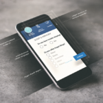
WebMD One Design System
We needed a digital design system to unite our platform experience and expedite our efforts.
Client
WebMD Health Services
Responsibilities
Systems Design
Visual Design
User Interface
Interaction Design
Deliverables
Form Styles
Typography
Screen Templates
Icons
Project SUmmary
Our new platform needed a new digital design system to unite our products under the new WebMD One platform. We had a solid start with our assessment and challenges products, and were quickly able to adapt those designs and complement them with a full UI toolkit.
This resulted in a cohesive visual language and platform experience that was easier to use, more visually appealing, and significantly cut our product design and delivery time.

Final designs
We used Google’s Material UI kit as our basis, opting to customize with our own colors, typography, and iconography. As we iterated, we also made adjustments to the inputs and form fields.
Once we were satisfied with the design kit, we published a set of templates and guidelines for what to use and when, so we could accelerate development and design efforts across the company.


