Echo Feedback + Admin Experience

We needed a more customer-friendly feedback process in the Echo companion app to increase the amount and quality of customer feedback, as well as accelerate product improvements prior to general availability.

Client

Amazon, Lab126

Responsibilities

User Experience (UX)
Product Design
Interaction Design

Deliverables

Quantitative Analysis
Product Strategy
Wireframes
User Flows

Project SUmmary

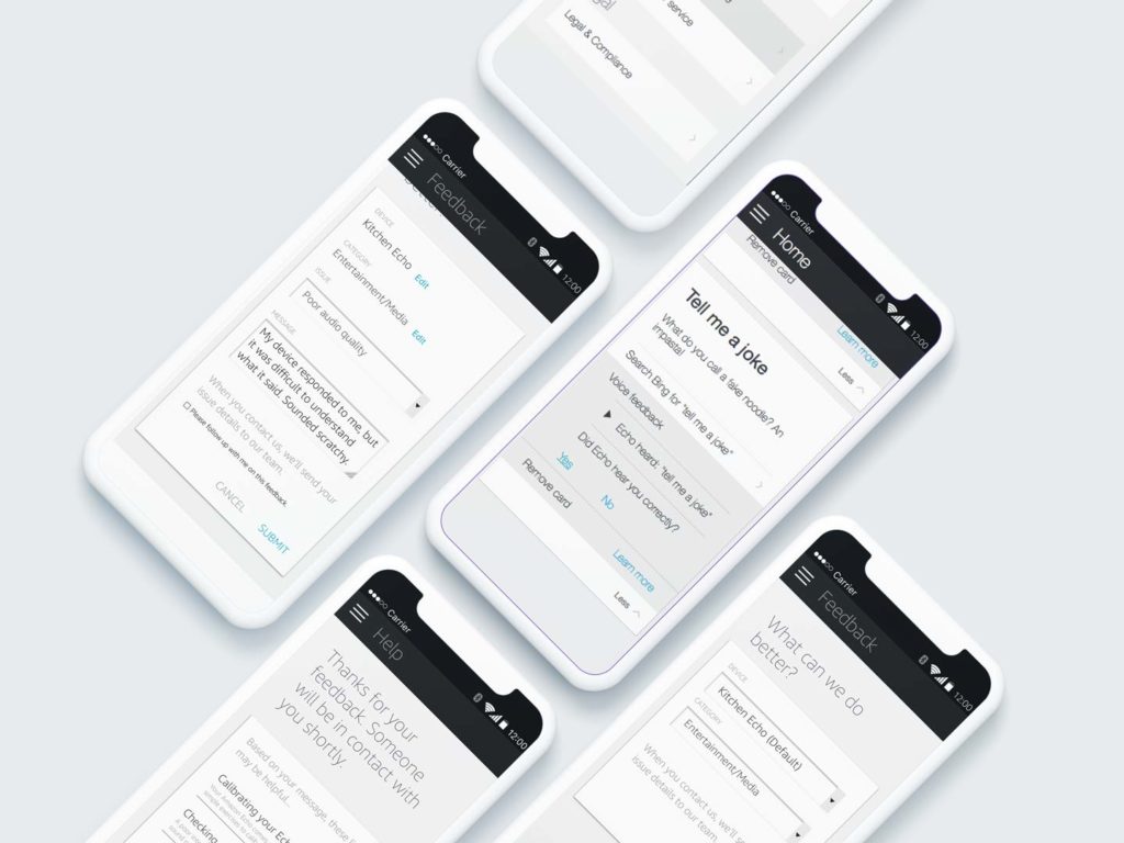
Echo desperately needed customer feedback during Beta to ensure we would be able to deliver the best customer experience at launch. We were fortunate in that our testers were actively submitting feedback through the companion app. The business wanted to “improve the customer feedback flow”.

After some discovery, I learned that it was taking a long time (and a lot of dollars) for our representatives to respond to feedback; that  once we did get it, it was difficult to categorize; and that some feedback was not being routed efficiently or correctly to our development teams. I sought a solution that would address these business problems while also addressing customer pain points I was finding through analytics data.

Early on, I chose to focus on three customer pain points:

  • making it easier to figure out how to submit feedback
  • reduce the amount of information the customer needs to enter to submit feedback
  • when possible, give the customer some ideas for corrective action (because nothing’s as frustrating as being stuck)
APproach

I was fortunate enough to have analytics readily available. I was able to use this data to refine the business problem and develop solutions that would better serve the customer and our internal stakeholders.

Use What We Know

Next, I examined the modalities the customer might be responding to: Was it feedback on the Skill or the utterance?

The answer made a difference on who could help and who could leverage that feedback to improve the product. It also made a difference as to what information we had and could pass on to our customer service teams.

Smarter categorization

I started by poring through our feedback logs and was able to identify customer patterns of feedback. The existing set of categories were broad, making an expedient response challenging to both submit and utilize.

I explored more granular hierarchies of categorization that would better serve our customers and help our customer service representatives and engineers respond more quickly.

Make it easy to succeed

Finally, I examined the paths for submitting feedback. Customers could only give input through “Feedback” and “Help”. Some customers had a hard time finding the form, which meant it was several clicks or taps in and we were missing out on a lot of customer feedback.

To combat this challenge, I added an affordance directly to the card.This was much easier to discover and use, and we would be able to leverage the data tied to that card to pre-fill some or all of the form. The less effort they would have to put forward, the more likely they were to share (the endowed progress effect).

All the customer would have to do is review, add a few details, and submit. 

Final designs

MORE portfolio items